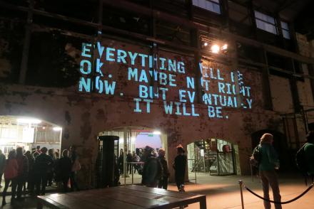
In this project we take Herman Melville’s 1851 book Moby-Dick: The Whale and alter features of the page such as line length, type size, leading, white space and tracking in order to graphically explore the structural and lexical qualities of written language. For example, in chapter 42 we vary the tracking (the space between the letters) according to the number of words in each sentence – short sentences are tightly tracked while long sentences are given more space. This visual strategy of spatial variation reveals Melville’s extraordinary range of sentence length (fig 1), which he uses to build and release dramatic tension. It is one of the many ways we use graphical alteration to surface the structural and formal aspects of Melville’s writing.
Consisting of 135 visual experiments, (one for each chapter of the novel) Altered Moby-Dick is a hybrid text – part literature and part information visualisation. We use graphical alteration to surface the structural and formal aspects of Melville’s writing, enabling literary scholars to move beyond conventional practices of interpretation such as close reading.
The Moby-Dick Project appears in a Special Edition of the Open Library of Humanities Journal called Remaking Collections (forthcoming 2018). The project has also been presented at the AIGA Converge Disciplinarities and Digital Scholarship Conference, University of Southern California (2017) and the Digital Material Symposium, Australian National University, Canberra (2017).
Design research assistant: Kristelle De Freitas


